Temperature Conversion Graph
Saturday, 10 January 2009 | 0 Comments
As I was putting together a lesson on using conversion graphs, I couldn’t find a nice temperature conversion graph – so I created one.
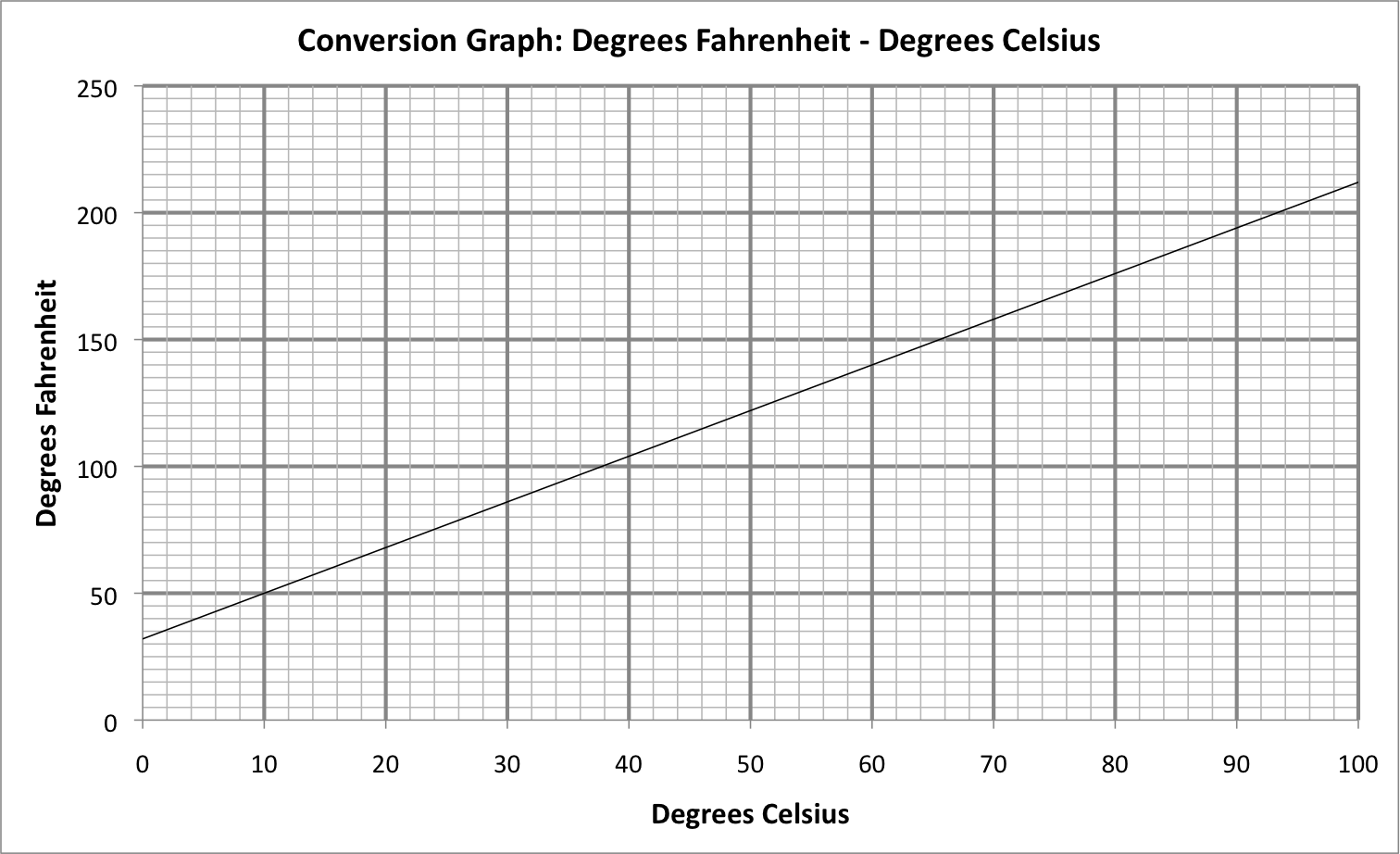
Click the image above for a good quality PNG file ready for use.
Or, if you want to edit the graph a little, use the Excel file below.
Updated 22 May 2012, I’ve made 3 more conversion graphs available on my new site, MathsFaculty:
Posted in • Lesson Idea • Graphs • Printable • Software • Excel | Short URL: http://mths.co/1330
Post a comment
Commenting is not available in this channel entry.New Subscribe to the …
MathsLinksemail newsletter
Get updates…
About
Simon Job — eleventh year of teaching maths in a public high school in Western Sydney, Australia.
MathsClass is about teaching and learning in a maths classroom. more→
Archive
Elsewhere
 @simonjob
updates via @mathslinks
Recently read/found.
Piano Keys
maths musicThe Size of the Piano Keyboard
maths musicCalculating Fret Positions
music maths
Comments
There are no comments for this entry yet.