Stem-and-leaf plots… an activity
Sunday, 03 August 2014 | 0 Comments
I recently came across the blog Resourceaholic. As a fellow resourceaholic, I immediately added it to my feed reader. In the post, Long Live Stem and Leaf, there's an image of a "real-life" Japanese train timetable represented as a stem-and-leaf plot, found on Wikipedia.
So good, I've added it to MathsLinks:
Glenn said to me,
We should do the same, would be much more compact.
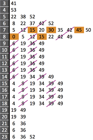
Good idea. I went to the Sydney Trains' timetable for the Western Line.
Here is the resulting stem-and-leaf version for the station local to me.

The shaded orange cells are express services, the strike-through purple cells are for trains on the Cumberland line that also stop at this station.
This compares to the downloadable 25 page PDF version (obviously with much more detail, 55 clicks on the on-line version to get all these times, or a $3.79 app.
If I were still a commuter, I wouldn't mind a credit card sized version showing there and back around my common travel times.
Why?
Well, it's always nice to have real data and there are only so many times that you can plot the heights of students in the classroom. Plus, this is a practical activity that could be as small or large as suits your class.
Lots of the common data discussions could happen, outliers, clusters.
Posted in • Activity • Lesson Idea • Data • MathsClass • MathsLinks • Media • Photo | Short URL: http://mths.co/3821
Post a comment
Commenting is not available in this channel entry.New Subscribe to the …
MathsLinksemail newsletter
Get updates…
About
Simon Job — eleventh year of teaching maths in a public high school in Western Sydney, Australia.
MathsClass is about teaching and learning in a maths classroom. more→
Archive
Elsewhere
 @simonjob
updates via  @mathslinks
Recently read/found.
Being a Vector is not Mutually Exclusive – Ringo Mok
maths vectorsInstagram
Gcf howie_hua maths
Comments
There are no comments for this entry yet.